7.1 Regression
Regression is a method by which we can determine the existence and strength of the relationship between two or more variables. This can be thought of as drawing lines, ideally straight lines, through data points.
Linear regression is our method of choice for examining continuous outcome variables. Broadly, there are often two separate goals in regression:
- Prediction: fitting a predictive model to an observed dataset, then using that model to make predictions about an outcome from a new set of explanatory variables;
- Explanation: fit a model to explain the inter-relationships between a set of variables.
Figure 7.1 unifies the terms we will use throughout.
A clear scientific question should define our explanatory variable of interest \((x)\), which sometimes gets called an exposure, predictor, or independent variable.
Our outcome of interest will be referred to as the dependent variable or outcome \((y)\); it is sometimes referred to as the response.
In simple linear regression, there is a single explanatory variable and a single dependent variable, and we will sometimes refer to this as univariable linear regression.
When there is more than one explanatory variable, we will call this multivariable regression.
Avoid the term multivariate regression, which means more than one dependent variable.
We don’t use this method and we suggest you don’t either!
Note that in linear regression, the dependent variable is always continuous; it cannot be a categorical variable. The explanatory variables can be either continuous or categorical.
7.1.1 The Question (1)
We will illustrate our examples of linear regression using a classical question which is important to many of us! This is the relationship between coffee consumption and blood pressure (and therefore cardiovascular events, such as myocardial infarction and stroke). There has been a lot of backwards and forwards over the decades about whether coffee is harmful, has no effect, or is in fact beneficial.
Figure 7.1 shows a linear regression example. Each point is a person. The explanatory variable is average number of cups of coffee per day \((x)\) and systolic blood pressure is the dependent variable \((y)\). This next bit is important! These data are made up, fake, randomly generated, fabricated, not real.14 So please do not alter your coffee habit on the basis of these plots!
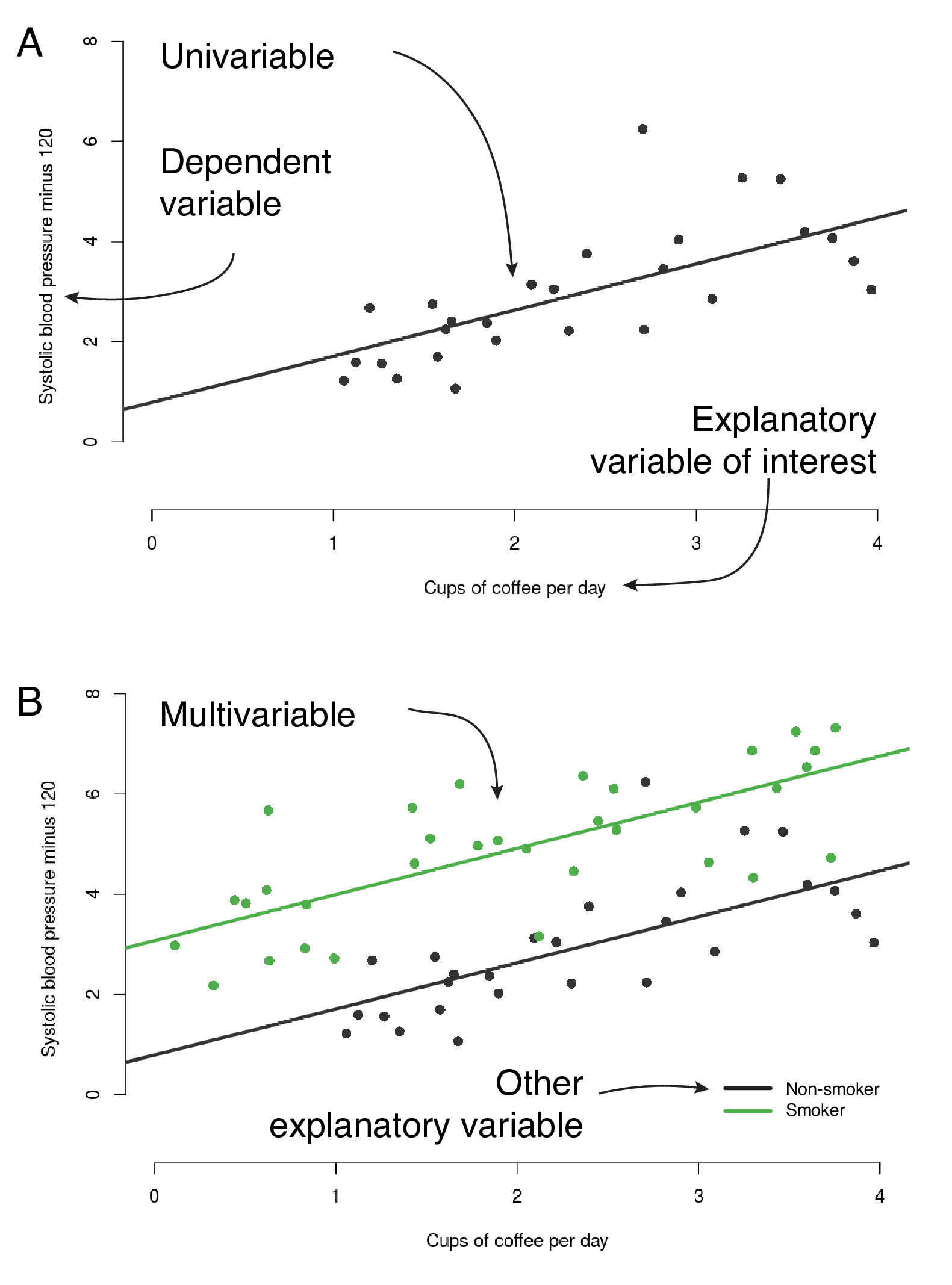
FIGURE 7.1: The anatomy of a regression plot. A - univariable linear regression, B - multivariable linear regression.
7.1.2 Fitting a regression line
Simple linear regression uses the ordinary least squares method for fitting. The details are beyond the scope of this book, but if you want to get out the linear algebra/matrix maths you did in high school, an enjoyable afternoon can be spent proving to yourself how it actually works.
Figure 7.2 aims to make this easy to understand. The maths defines a line which best fits the data provided. For the line to fit best, the distances between it and the observed data should be as small as possible. The distance from each observed point to the line is called a residual - one of those statistical terms that bring on the sweats. It refers to the residual difference left over after the line is fitted.
You can use the simple regression Shiny app to explore the concept. We want the residuals to be as small as possible. We can square each residual (to get rid of minuses and make the algebra more convenient) and add them up. If this number is as small as possible, the line is fitting as best it can. Or in more formal language, we want to minimise the sum of squared residuals.
The regression apps and example figures in this chapter have been adapted from https://github.com/mwaskom/ShinyApps and https://github.com/ShinyEd/intro-stats with permission from Michael Waskom and Mine Çetinkaya-Rundel, thank you to them.
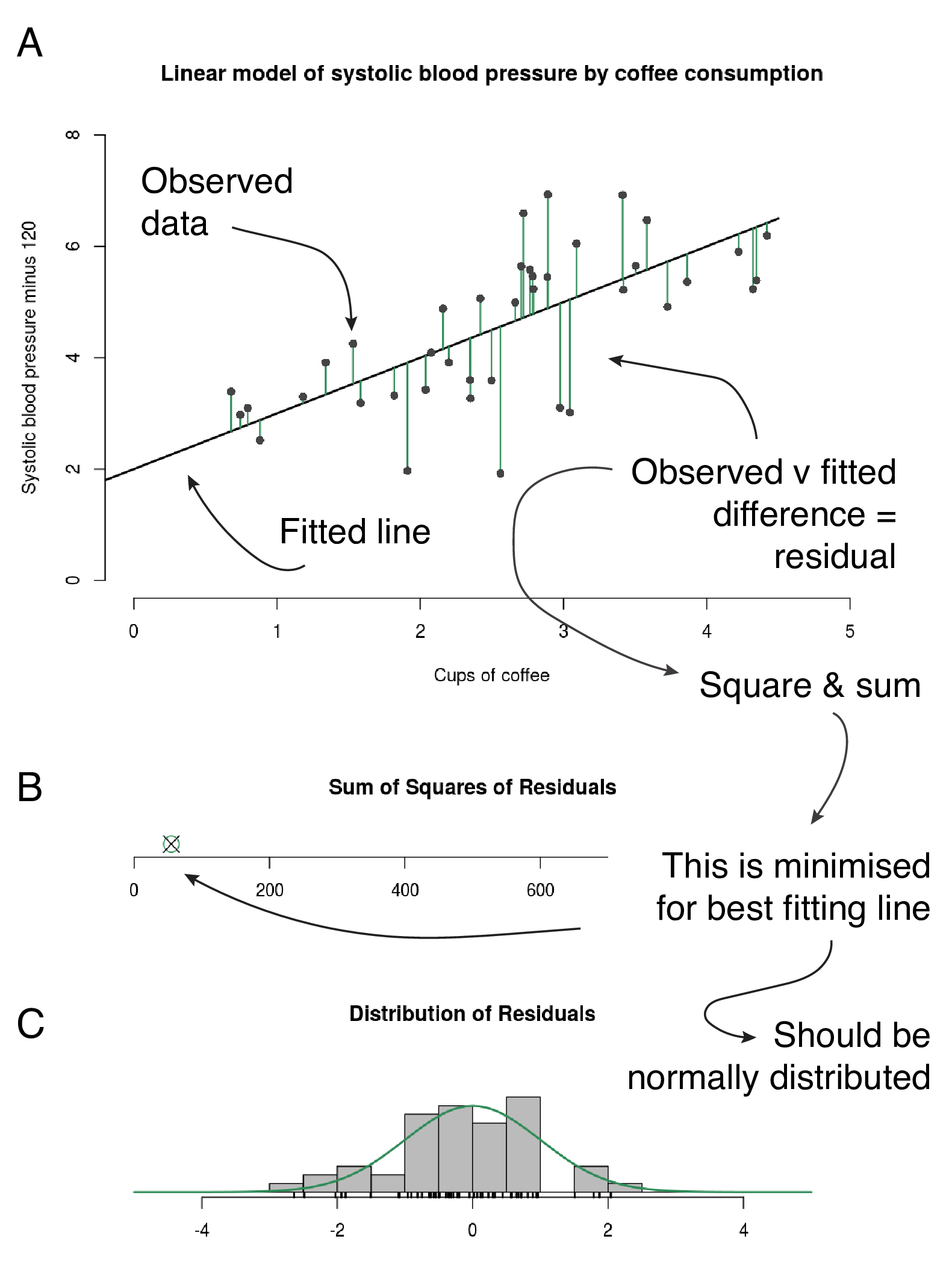
FIGURE 7.2: How a regression line is fitted. A - residuals are the green lines: the distance between each data point and the fitted line. B - the green circle indicates the minimum for these data; its absolute value is not meaningful or comparable with other datasets. Follow the “simple regression Shiny app” link to interact with the fitted line. A new sum of squares of residuals (the black cross) is calculated every time you move the line. C - Distribution of the residuals. App and plots adapted from https://github.com/mwaskom/ShinyApps with permission.
7.1.3 When the line fits well
Linear regression modelling has four main assumptions:
- Linear relationship between predictors and outcome;
- Independence of residuals;
- Normal distribution of residuals;
- Equal variance of residuals.
You can use the simple regression diagnostics shiny app to get a handle on these.
Figure 7.3 shows diagnostic plots from the app, which we will run ourselves below Figure 7.11.
Linear relationship
A simple scatter plot should show a linear relationship between the explanatory and the dependent variable, as in Figure 7.3A. If the data describe a non-linear pattern (Figure 7.3B), then a straight line is not going to fit it well. In this situation, an alternative model should be considered, such as including a quadratic (squared, \(x^2\)) term.
Independence of residuals
The observations and therefore the residuals should be independent. This is more commonly a problem in time series data, where observations may be correlated across time with each other (autocorrelation).
Normal distribution of residuals
The observations should be normally distributed around the fitted line. This means that the residuals should show a normal distribution with a mean of zero (Figure 7.3A). If the observations are not equally distributed around the line, the histogram of residuals will be skewed and a normal Q-Q plot will show residuals diverging from the straight line (Figure 7.3B) (see Section 6.4.2).
Equal variance of residuals
The distance of the observations from the fitted line should be the same on the left side as on the right side. Look at the fan-shaped data on the simple regression diagnostics Shiny app. This fan shape can be seen on the residuals vs fitted values plot.
Everything we talk about in this chapter is really about making sure that the line you draw through your data points is valid. It is about ensuring that the regression line is appropriate across the range of the explanatory variable and dependent variable. It is about understanding the underlying data, rather than relying on a fancy statistical test that gives you a p-value.
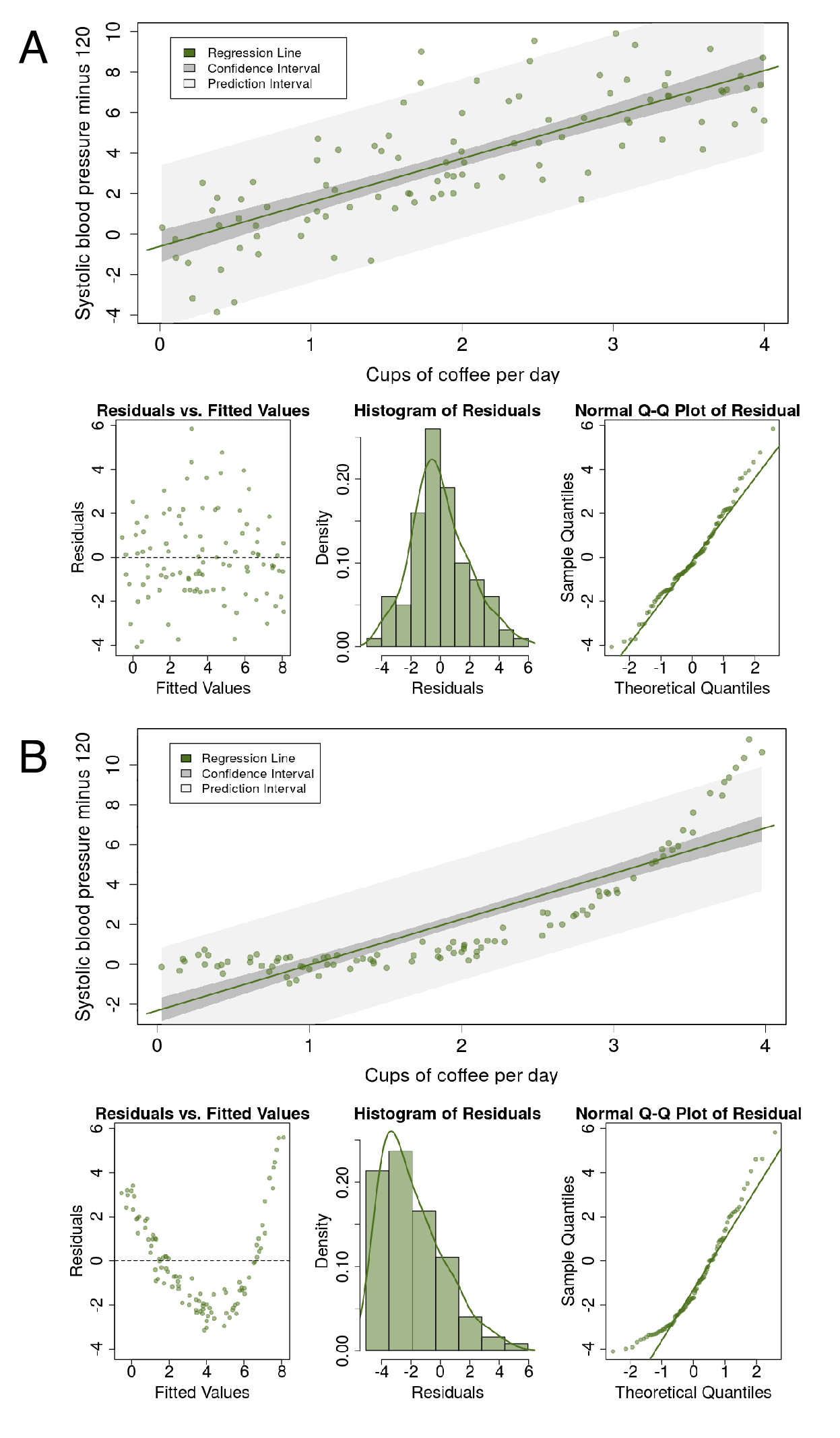
FIGURE 7.3: Regression diagnostics. A - this is what a linear fit should look like. B - this is not approriate; a non-linear model should be used instead. App and plots adapted from https://github.com/ShinyEd/intro-stats with permission.
7.1.4 The fitted line and the linear equation
We promised to keep the equations to a minimum, but this one is so important it needs to be included. But it is easy to understand, so fear not.
Figure 7.4 links the fitted line, the linear equation, and the output from R. Some of this will likely be already familiar to you.
Figure 7.4A shows a scatter plot with fitted lines from a multivariable linear regression model. The plot is taken from the multivariable regression Shiny app. Remember, these data are simulated and are not real. This app will really help you understand different regression models; more on this below. The app allows us to specify “the truth” with the sliders on the left-hand side. For instance, we can set the \(intercept=1\), meaning that when \(x=0\), the value of the dependent variable, \(y=1\).
Our model has a continuous explanatory variable of interest (average coffee consumption) and a further categorical variable (smoking). In the example the truth is set as \(intercept=1\), \(\beta_1=1\) (true effect of coffee on blood pressure, slope of line), and \(\beta_2=2\) (true effect of smoking on blood pressure). The points on the plot are simulated and include random noise.
What does \(\beta_1=1\) mean? This is the slope of the line. So for each unit on the x-axis, there is a corresponding increase of one unit on the y-axis.
Figure 7.4B shows the default output in R for this linear regression model. Look carefully and make sure you are clear how the fitted lines, the linear equation, and the R output fit together. In this example, the random sample from our true population specified above shows \(intercept=0.67\), \(\beta_1=1.00\) (coffee), and \(\beta_2=2.48\) (smoking). A p-value is provided (\(Pr(> \left| t \right|)\)), which is the result of a null hypothesis significance test for the slope of the line being equal to zero.
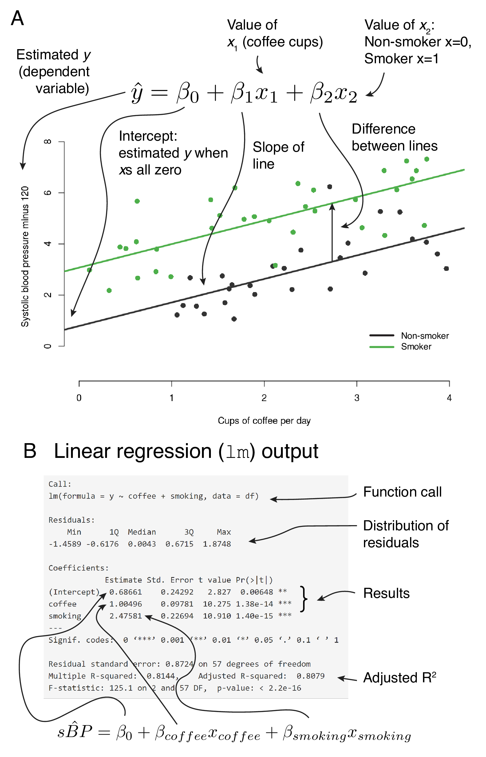
FIGURE 7.4: Linking the fitted line, regression equation and R output.
7.1.5 Effect modification
Effect modification occurs when the size of the effect of the explanatory variable of interest (exposure) on the outcome (dependent variable) differs depending on the level of a third variable. Said another way, this is a situation in which an explanatory variable differentially (positively or negatively) modifies the observed effect of another explanatory variable on the outcome.
Figure 7.5 shows three potential causal pathways using examples from the multivariable regression Shiny app.
In the first, smoking is not associated with the outcome (blood pressure) or our explanatory variable of interest (coffee consumption).
In the second, smoking is associated with elevated blood pressure, but not with coffee consumption. This is an example of effect modification.
In the third, smoking is associated with elevated blood pressure and with coffee consumption. This is an example of confounding.
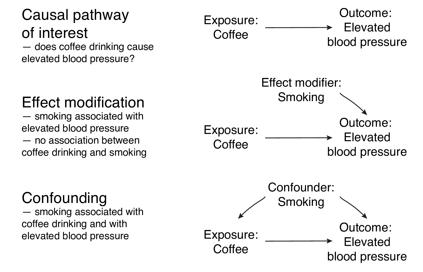
FIGURE 7.5: Causal pathways, effect modification and confounding.
Additive vs. multiplicative effect modification (interaction)
The name for these concepts differs depending on the field you work in. Effect modification can be additive or multiplicative. We can refer to multiplicative effect modification as “a statistical interaction”.
Figure 7.6 should make it clear exactly how these work. The data have been set up to include an interaction between the two explanatory variables. What does this mean?
- \(intercept=1\): the blood pressure (\(\hat{y}\)) for non-smokers who drink no coffee (all \(x=0\));
- \(\beta_1=1\) (
coffee): the additional blood pressure for each cup of coffee drunk by non-smokers (slope of the line when \(x_2=0\)); - \(\beta_2=1\) (
smoking): the difference in blood pressure between non-smokers and smokers who drink no coffee (\(x_1=0\)); - \(\beta_3=1\) (
coffee:smokinginteraction): the blood pressure (\(\hat{y}\)) in addition to \(\beta_1\) and \(\beta_2\), for each cup of coffee drunk by smokers (\(x_2=1)\).
You may have to read that a couple of times in combination with looking at Figure 7.6.
With the additive model, the fitted lines for non-smoking vs smoking must always be parallel (the statistical term is ‘constrained’). Look at the equation in Figure 7.6B and convince yourself that the lines can never be anything other than parallel.
A statistical interaction (or multiplicative effect modification) is a situation where the effect of an explanatory variable on the outcome is modified in non-additive manner. In other words using our example, the fitted lines are no longer constrained to be parallel.
If we had not checked for an interaction effect, we would have inadequately described the true relationship between these three variables.
What does this mean back in reality? Well it may be biologically plausible for the effect of smoking on blood pressure to increase multiplicatively due to a chemical interaction between cigarette smoke and caffeine, for example.
Note, we are just trying to find a model which best describes the underlying data. All models are approximations of reality.
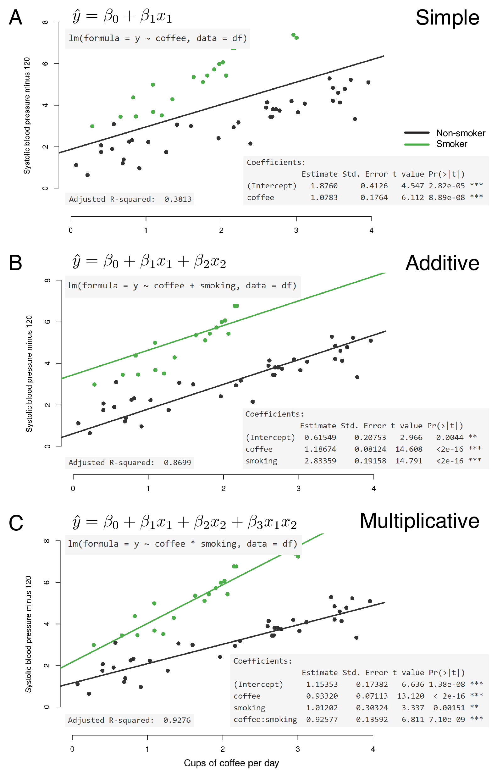
FIGURE 7.6: Multivariable linear regression with additive and multiplicative effect modification.
7.1.6 R-squared and model fit
Figure 7.6 includes a further metric from the R output: Adjusted R-squared.
R-squared is another measure of how close the data are to the fitted line. It is also known as the coefficient of determination and represents the proportion of the dependent variable which is explained by the explanatory variable(s). So 0.0 indicates that none of the variability in the dependent is explained by the explanatory (no relationship between data points and fitted line) and 1.0 indicates that the model explains all of the variability in the dependent (fitted line follows data points exactly).
R provides the R-squared and the Adjusted R-squared.
The adjusted R-squared includes a penalty the more explanatory variables are included in the model.
So if the model includes variables which do not contribute to the description of the dependent variable, the adjusted R-squared will be lower.
Looking again at Figure 7.6, in A, a simple model of coffee alone does not describe the data well (adjusted R-squared 0.38). Adding smoking to the model improves the fit as can be seen by the fitted lines (0.87). But a true interaction exists in the actual data. By including this interaction in the model, the fit is very good indeed (0.93).
7.1.7 Confounding
The last important concept to mention here is confounding. Confounding is a situation in which the association between an explanatory variable (exposure) and outcome (dependent variable) is distorted by the presence of another explanatory variable.
In our example, confounding exists if there is an association between smoking and blood pressure AND smoking and coffee consumption (Figure 7.5C). This exists if smokers drink more coffee than non-smokers.
Figure 7.7 shows this really clearly. The underlying data have now been altered so that those who drink more than two cups of coffee per day also smoke and those who drink fewer than two cups per day do not smoke. A true effect of smoking on blood pressure is simulated, but there is NO effect of coffee on blood pressure in this example.
If we only fit blood pressure by coffee consumption (Figure 7.7A), then we may mistakenly conclude a relationship between coffee consumption and blood pressure. But this does not exist, because the ground truth we have set is that no relationship exists between coffee and blood pressure. We are actually looking at the effect of smoking on blood pressure, which is confounding the effect of coffee on blood pressure.
If we include the confounder in the model by adding smoking, the true relationship becomes apparent. Two parallel flat lines indicating no effect of coffee on blood pressure, but a relationship between smoking and blood pressure. This procedure is referred to as controlling for or adjusting for confounders.
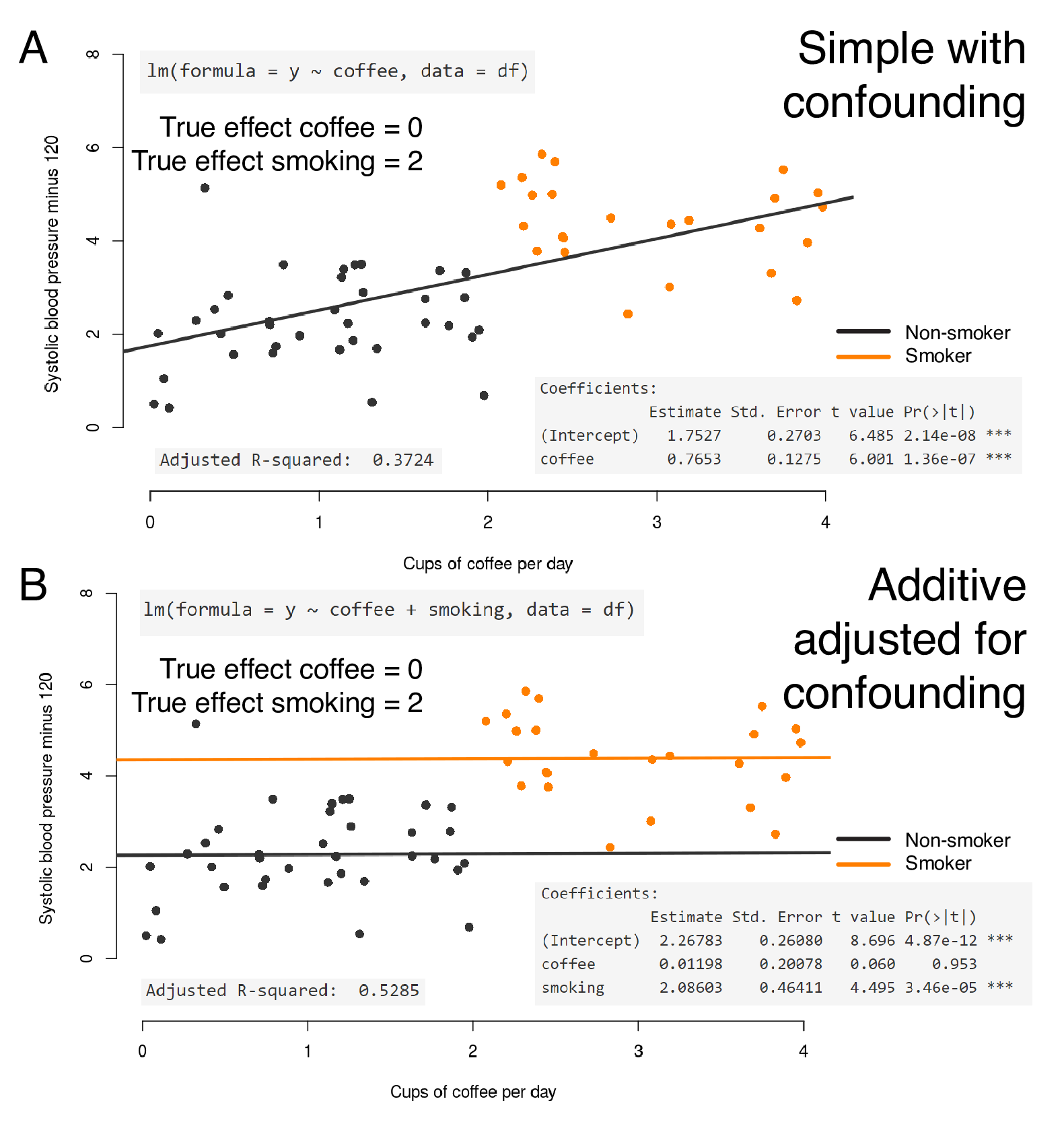
FIGURE 7.7: Multivariable linear regression with confounding of coffee drinking by smoking.
7.1.8 Summary
We have intentionally spent some time going through the principles and applications of linear regression because it is so important. A firm grasp of these concepts leads to an understanding of other regression procedures, such as logistic regression and Cox Proportional Hazards regression.
We will now perform all this ourselves in R using the gapminder dataset which you are familiar with from preceding chapters.
These data are created on the fly by the Shiny apps that are linked and explained in this chapter. This enables you to explore the different concepts using the same variables. For example, if you tell the multivariable app that coffee and smoking should be confounded, it will change the underlying dataset to conform. You can then investigate the output of the regression model to see how that corresponds to the “truth” (that in this case, you control).↩︎