4.8 Box plots
Box plots are our go to method for quickly visualising summary statistics of a continuous outcome variable (such as life expectancy in the gapminder dataset, Figure 4.15).
Box plots include:
- the median (middle line in the box)
- inter-quartile range (IQR, top and bottom parts of the boxes - this is where 50% of your data is)
- whiskers (the black lines extending to the lowest and highest values that are still within 1.5*IQR)
- outliers (any observations out with the whiskers)
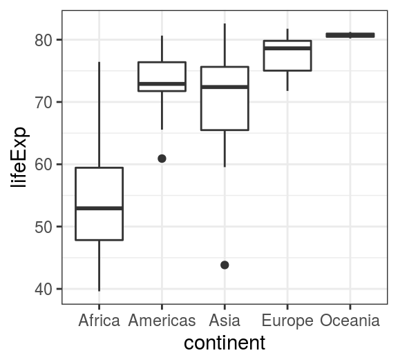
FIGURE 4.15: geom_boxplot() - Boxplots of life expectancies within each continent in year 2007.