6.5 Compare the means of two groups
6.5.1 t-test
A t-test is used to compare the means of two groups of continuous measurements. Volumes have been written about this elsewhere, and we won’t rehearse it here.
There are a few variations of the t-test. We will use two here. The most useful in our context is a two-sample test of independent groups. Repeated-measures data, such as comparing the same countries in different years, can be analysed using a paired t-test.
6.5.2 Two-sample t-tests
Referring to Figure 6.3, let’s compare life expectancy between Asia and Europe for 2007. What is imperative is that you decide what sort of difference exists by looking at the boxplot, rather than relying on the t-test output. The median for Europe is clearly higher than in Asia. The distributions overlap, but it looks likely that Europe has a higher life expectancy than Asia.
By running the two-sample t-test here, we make the assumption that life expectancy in each country represents an independent measurement of life expectancy in the continent as a whole. This isn’t quite right if you think about it carefully.
Imagine a room full of enthusiastic geniuses learning R. They arrived today from various parts of the country. For reasons known only to you, you want to know whether the average (mean) height of those wearing glasses is different to those with perfect vision.
You measure the height of each person in the room, check them for glasses, and run a two-sample t-test.
In statistical terms, your room represents a sample from an underlying population. Your ability to answer the question accurately relies on a number of factors. For instance, how many people are in the room? The more there are, the more certain you can be about the mean measurement in your groups being close to the mean measurement in the overall population.
What is also crucial is that your room is a representative sample of the population. Are the observations independent, i.e., is each observation unrelated to the others?
If you have inadvertently included a family of bespectacled nerdy giants, not typical of those in the country as a whole, your estimate will be wrong and your conclusion incorrect.
So in our example of countries and continents, you have to assume that the mean life expectancy of each country does not depend on the life expectancies of other countries in the group. In other words, that each measurement is independent.
ttest_data <- gapdata %>%                    # save as object ttest_data
  filter(year == 2007) %>%                   # 2007 only
  filter(continent %in% c("Asia", "Europe")) # Asia/Europe only

ttest_result <- ttest_data %>%               # example using pipe
  t.test(lifeExp ~ continent, data = .)      # note data = ., see below
ttest_result
##
## Welch Two Sample t-test
##
## data: lifeExp by continent
## t = -4.6468, df = 41.529, p-value = 3.389e-05
## alternative hypothesis: true difference in means is not equal to 0
## 95 percent confidence interval:
## -9.926525 -3.913705
## sample estimates:
## mean in group Asia mean in group Europe
## 70.72848 77.64860The Welch two-sample t-test is the most flexible and copes with differences in variance (variability) between groups, as in this example. The difference in means is provided at the bottom of the output. The t-value, degrees of freedom (df) and p-value are all provided. The p-value is 0.00003.
We used the assignment arrow to save the results of the t-test into a new object called ttest_result.
If you look at the Environment tab, you should see ttest_result there.
If you click on it - to view it - you’ll realise that it’s not structured like a table, but a list of different pieces of information.
The structure of the t-test object is shown in Figure 6.5.
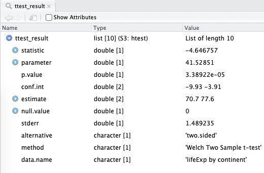
FIGURE 6.5: A list object that is the result of a t-test in R. We will show you ways to access these numbers and how to wrangle them into more familiar tables/tibbles.
The p-value, for instance, can be accessed like this:
## [1] 3.38922e-05The confidence interval of the difference in mean life expectancy between the two continents:
## [1] -9.926525 -3.913705
## attr(,"conf.level")
## [1] 0.95
The broom package provides useful methods for ‘tidying’ common model outputs into a tibble.
So instead of accessing the various bits of information by checking the names() and then using the $ operator, we can use functions called tidy() and glance() to wrangle the statistical output into a table:
| estimate | estimate1 | estimate2 | statistic | p.value | parameter | conf.low | conf.high |
|---|---|---|---|---|---|---|---|
| -6.920115 | 70.72848 | 77.6486 | -4.646757 | 3.39e-05 | 41.52851 | -9.926525 | -3.913705 |
Reminder: When the pipe sends data to the wrong place: use data = . to redirect it
In the code above, the data = . bit is necessary because the pipe usually sends data to the beginning of function brackets.
So gapdata %>% t.test(lifeExp ~ continent) would be equivalent to t.test(gapdata, lifeExp ~ continent).
However, this is not an order that t.test() will accept.
t.test() wants us to specify the formula first, and then wants the data these variables are present in.
So we have to use the . to tell the pipe to send the data to the second argument of t.test(), not the first.
6.5.3 Paired t-tests
Consider that we want to compare the difference in life expectancy in Asian countries between 2002 and 2007. The overall difference is not impressive in the boxplot.
We can plot differences at the country level directly.
paired_data <- gapdata %>%             # save as object paired_data
  filter(year %in% c(2002, 2007)) %>%  # 2002 and 2007 only
  filter(continent == "Asia")          # Asia only

paired_data %>%
  ggplot(aes(x = year, y = lifeExp,
             group = country)) +       # for individual country lines
  geom_line()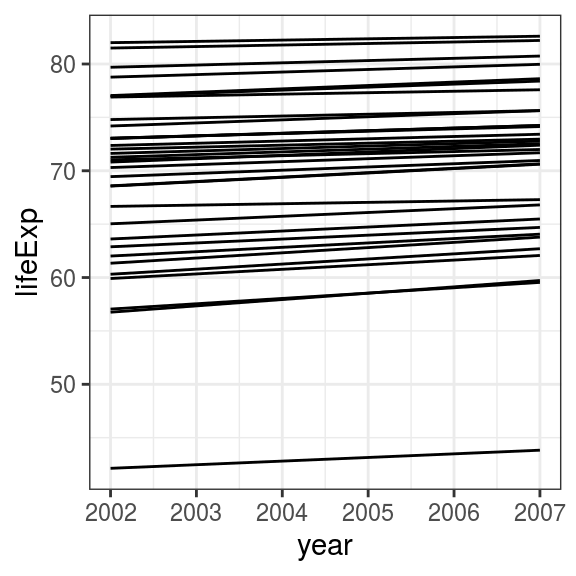
FIGURE 6.6: Line plot: Change in life expectancy in Asian countries from 2002 to 2007.
What is the difference in life expectancy for each individual country? We don’t usually have to produce this directly, but here is one method.
paired_table <- paired_data %>%        # save object paired_data
  select(country, year, lifeExp) %>%   # select vars interest
  pivot_wider(names_from = year,       # put years in columns
              values_from = lifeExp) %>%
  mutate(
    dlifeExp = `2007` - `2002`         # difference in means
  )
paired_table
## # A tibble: 33 x 4
## country `2002` `2007` dlifeExp
## <fct> <dbl> <dbl> <dbl>
## 1 Afghanistan 42.1 43.8 1.70
## 2 Bahrain 74.8 75.6 0.84
## 3 Bangladesh 62.0 64.1 2.05
## 4 Cambodia 56.8 59.7 2.97
## 5 China 72.0 73.0 0.933
## 6 Hong Kong, China 81.5 82.2 0.713
## 7 India 62.9 64.7 1.82
## 8 Indonesia 68.6 70.6 2.06
## 9 Iran 69.5 71.0 1.51
## 10 Iraq 57.0 59.5 2.50
## # … with 23 more rows## # A tibble: 1 x 1
## `mean(dlifeExp)`
## <dbl>
## 1 1.49On average, therefore, there is an increase in life expectancy of 1.5 years in Asian countries between 2002 and 2007. Let’s test whether this number differs from zero with a paired t-test:
##
##  Paired t-test
##
## data:  lifeExp by year
## t = -14.338, df = 32, p-value = 1.758e-15
## alternative hypothesis: true difference in means is not equal to 0
## 95 percent confidence interval:
##  -1.706941 -1.282271
## sample estimates:
## mean of the differences
##               -1.494606
The results show a highly significant difference (p-value = 0.000000000000002). The average difference of 1.5 years is highly consistent between countries, as shown on the line plot, and this differs from zero. It is up to you the investigator to interpret the relevance of the effect size of 1.5 years in reporting the finding. A highly significant p-value does not necessarily mean there is a (clinically) significant change between the two groups (or in this example, two time points).
6.5.4 What if I run the wrong test?
As an exercise, we can repeat this analysis comparing these data in an unpaired manner. The resulting (unpaired) p-value is 0.460. Remember, a paired t-test of the same data (life expectancies of Asian countries in 2002 and 2007) showed a very different, significant result. In this case, running an unpaired two-sample t-test is just wrong - as the data are indeed paired. It is important that the investigator really understands the data and the underlying processes/relationships within it. R will not know and therefore cannot warn you if you run the wrong test.