4.2 Anatomy of ggplot explained
We will now explain the six steps shown in Figure 4.1. Note that you only need the first two to make a plot, the rest are just to show you further functionality and optional customisations.
(1) Start by defining the variables, e.g., ggplot(aes(x = var1, y = var2)):
This creates the first plot in Figure 4.1.
Although the above code is equivalent to:
We tend to put the data first and then use the pipe (%>%) to send it to the ggplot() function.
This becomes useful when we add further data wrangling functions between the data and the ggplot().
For example, our plotting pipelines often look like this:
The lines that come before the ggplot() function are piped, whereas from ggplot() onwards you have to use +.
This is because we are now adding different layers and customisations to the same plot.
aes() stands for aesthetics - things we can see.
Variables are always inside the aes() function, which in return is inside a ggplot().
Take a moment to appreciate the double closing brackets )) - the first one belongs to aes(), the second one to ggplot().
(2) Choose and add a geometrical object
Let’s ask ggplot() to draw a point for each observation by adding geom_point():
We have now created the second plot in Figure 4.1, a scatter plot.
If we copy the above code and change just one thing - the x variable from gdpPercap to continent (which is a categorical variable) - we get what’s called a strip plot.
This means we are now plotting a continuous variable (lifeExp) against a categorical one (continent).
But the thing to note is that the rest of the code stays exactly the same, all we did was change the x =.
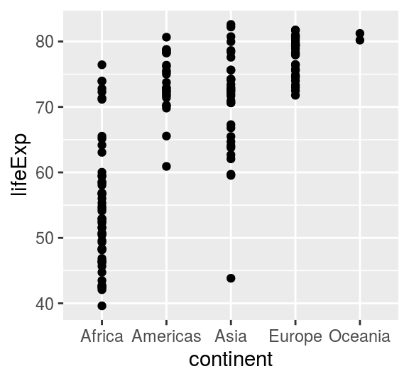
FIGURE 4.2: A strip plot using geom_point().
(3) specifying further variables inside aes()
Going back to the scatter plot (lifeExp vs gdpPercap), let’s use continent to give the points some colour.
We can do this by adding colour = continent inside the aes():
This creates the third plot in Figure 4.1. It uses the default colour scheme and will automatically include a legend.
Still with just two lines of code (ggplot(...) + geom_point()).
(4) specifying aesthetics outside aes()
It is very important to understand the difference between including ggplot arguments inside or outside of the aes() function.
The main aesthetics (things we can see) are: x, y, colour, fill, shape, size, and any of these could appear inside or outside the aes() function.
Press F1 on, e.g., geom_point(), to see the full list of aesthetics that can be used with this geom (this opens the Help tab).
If F1 is hard to summon on your keyboard, type in and run ?geom_point.
Variables (so columns of your dataset) have to be defined inside aes().
Whereas to apply a modification on everything, we can set an aesthetic to a constant value outside of aes().
For example, Figure 4.3 shows a selection of the point shapes built into R. The default shape used by geom_point() is number 16.
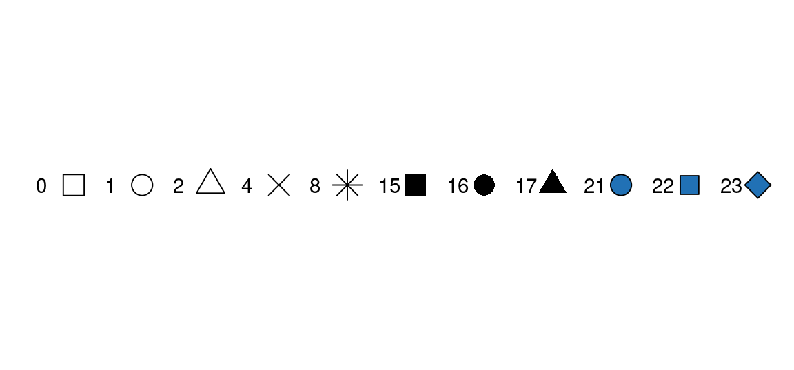
FIGURE 4.3: A selection of shapes for plotting. Shapes 0, 1, and 2 are hollow, whereas for shapes 21, 22, and 23 we can define both a colour and a fill (for the shapes, colour is the border around the fill).
To make all of the points in our figure hollow, let’s set their shape to 1.
We do this by adding shape = 1 inside the geom_point():
This creates the fourth plot in Figure 4.1.
(5) From one plot to multiple with a single extra line
Faceting is a way to efficiently create the same plot for subgroups within the dataset.
For example, we can separate each continent into its own facet by adding facet_wrap(~continent) to our plot:
gapdata2007 %>%
  ggplot(aes(x = gdpPercap, y = lifeExp, colour = continent)) +
geom_point(shape = 1) +
facet_wrap(~continent)This creates the fifth plot in Figure 4.1.
Note that we have to use the tilde (~) in facet_wrap().
There is a similar function called facet_grid() that will create a grid of plots based on two grouping variables, e.g., facet_grid(var1~var2).
Furthermore, facets are happy to quickly separate data based on a condition (so something you would usually use in a filter).
gapdata2007 %>%
  ggplot(aes(x = gdpPercap, y = lifeExp, colour = continent)) +
  geom_point(shape = 1) +
  facet_wrap(~pop > 50000000)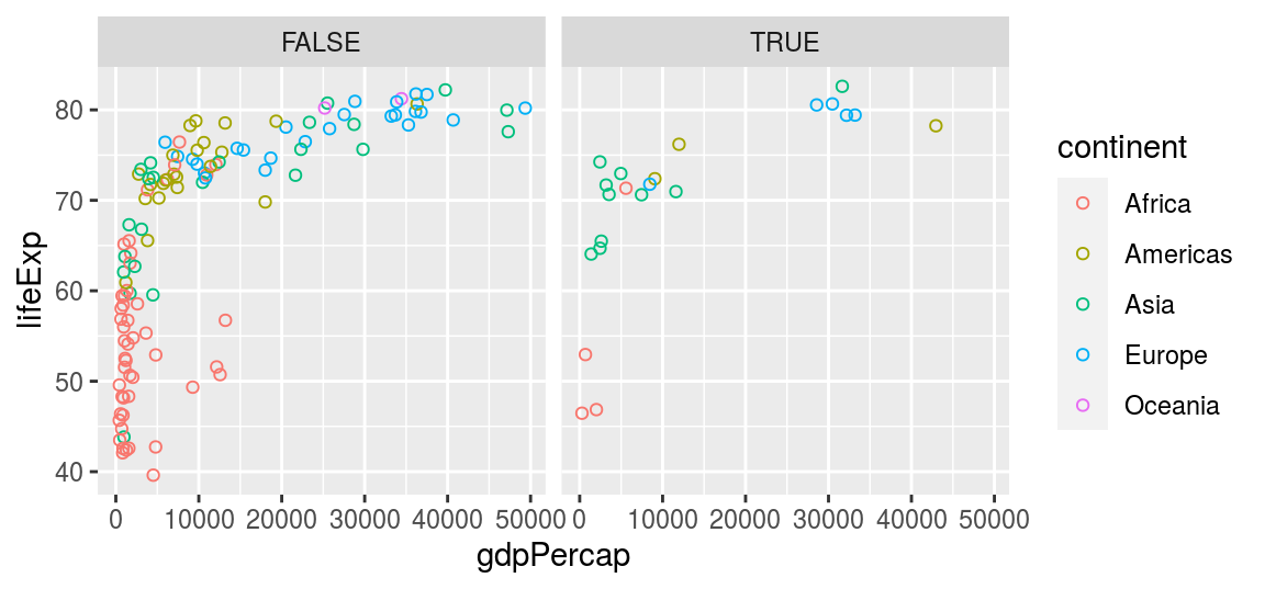
FIGURE 4.4: Using a filtering condition (e.g., population > 50 million) directly inside a facet_wrap().
On this plot, the facet FALSE includes countries with a population less than 50 million people, and the facet TRUE includes countries with a population greater than 50 million people.
The tilde (~) in R denotes dependency. It is mostly used by statistical models to define dependent and explanatory variables and you will see it a lot in the second part of this book.
(6) Grey to white background - changing the theme
Overall, we can customise every single thing on a ggplot. Font type, colour, size or thickness or any lines or numbers, background, you name it. But a very quick way to change the appearance of a ggplot is to apply a different theme. The signature ggplot theme has a light grey background and white grid lines (Figure 4.5).
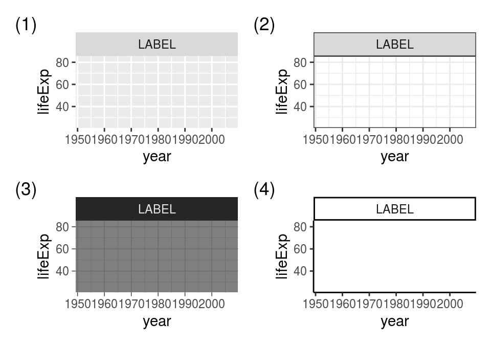
FIGURE 4.5: Some of the built-in ggplot themes (1) default (2) theme_bw(), (3) theme_dark(), (4) theme_classic().
As a final step, we are adding theme_bw() (“background white”) to give the plot a different look.
We have also divided the gdpPercap by 1000 (making the units “thousands of dollars per capita”).
Note that you can apply calculations directly on ggplot variables (so how we’ve done x = gdpPercap/1000 here).
gapdata2007 %>%
  ggplot(aes(x = gdpPercap/1000, y = lifeExp, colour = continent)) +
  geom_point(shape = 1) +
  facet_wrap(~continent) +
  theme_bw()
This creates the last plot in Figure 4.1.
This is how ggplot() works - you can build a plot by adding or modifying things one by one.