4.9 Multiple geoms, multiple aes()
One of the coolest things about ggplot() is that we can plot multiple geoms on top of each other!
Let’s add individual data points on top of the box plots:
This makes Figure 4.16(1).
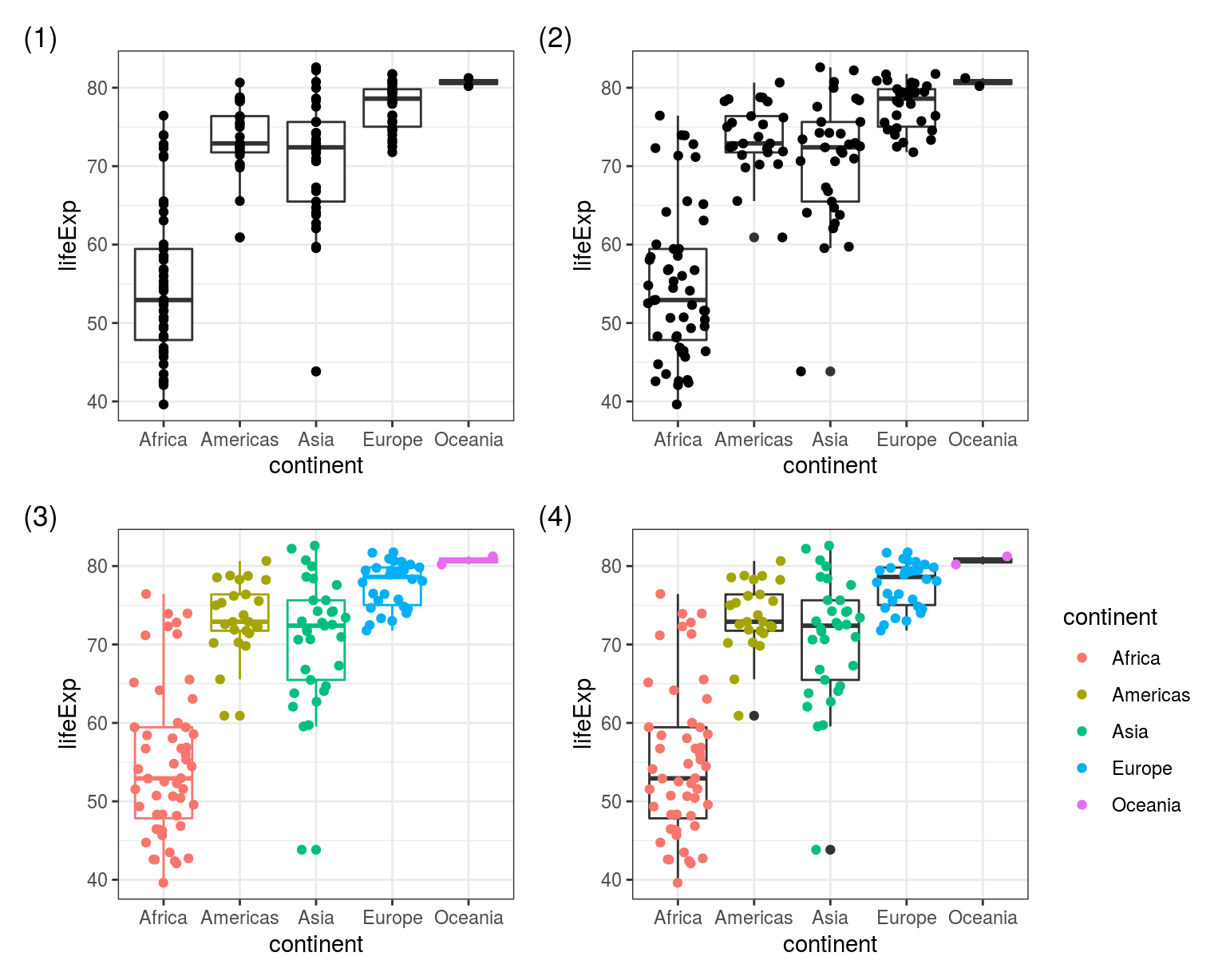
FIGURE 4.16: Multiple geoms together. (1) geom_boxplot() + geom_point(), (2) geom_boxplot() + geom_jitter(), (3) colour aesthetic inside ggplot(aes()), (4) colour aesthetic inside geom_jitter(aes()).
The only thing we’ve changed in (2) is replacing geom_point() with geom_jitter() - this spreads the points out to reduce overplotting.
But what’s really exciting is the difference between (3) and (4) in Figure 4.16. Spot it!
# (3)
gapdata2007 %>%
  ggplot(aes(x = continent, y = lifeExp, colour = continent)) +
  geom_boxplot() +
  geom_jitter()

# (4)
gapdata2007 %>%
  ggplot(aes(x = continent, y = lifeExp)) +
  geom_boxplot() +
  geom_jitter(aes(colour = continent))
This is new: aes() inside a geom, not just at the top!
In the code for (4) you can see aes() in two places - at the top and inside the geom_jitter().
And colour = continent was only included in the second aes().
This means that the jittered points get a colour, but the box plots will be drawn without (so just black).
This is exactly* what we see on 4.16.
*Nerd alert: the variation added by geom_jitter() is random, which means that when you recreate the same plots the points will appear in slightly different locations to ours. To make identical ones, add position = position_jitter(seed = 1) inside geom_jitter().
4.9.1 Worked example - three geoms together
Let’s combine three geoms by including text labels on top of the box plot + points from above.
We are creating a new tibble called label_data filtering for the maximum life expectancy countries at each continent (group_by(continent)):
label_data <- gapdata2007 %>%
  group_by(continent) %>%
  filter(lifeExp == max(lifeExp)) %>%
  select(country, continent, lifeExp)

# since we filtered for lifeExp == max(lifeExp)
# these are the maximum life expectancy countries at each continent:
label_data
## # A tibble: 5 x 3
## # Groups: continent [5]
## country continent lifeExp
## <fct> <fct> <dbl>
## 1 Australia Oceania 81.2
## 2 Canada Americas 80.7
## 3 Iceland Europe 81.8
## 4 Japan Asia 82.6
## 5 Reunion Africa 76.4The first two geoms are from the previous example (geom_boxplot() and geom_jitter()).
Note that ggplot() plots them in the order they are in the code - so box plots at the bottom, jittered points on the top.
We are then adding geom_label() with its own data option (data = label_data) as well as a new aesthetic (aes(label = country), Figure 4.17):
gapdata2007 %>%
  ggplot(aes(x = continent, y = lifeExp)) +
  # First geom - boxplot
  geom_boxplot() +
  # Second geom - jitter with its own aes(colour = )
  geom_jitter(aes(colour = continent)) +
  # Third geom - label, with its own dataset (label_data) and aes(label = )
  geom_label(data = label_data, aes(label = country))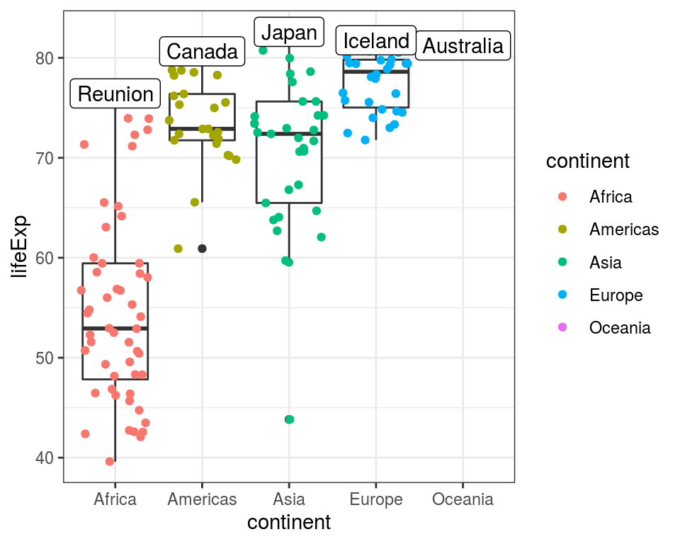
FIGURE 4.17: Three geoms together on a single plot: geom_boxplot(), geom_jitter(), and geom_label().
A few suggested experiments to try with the 3-geom plot code above:
- remove
data = label_data,fromgeom_label()and you’ll get all 142 labels (so it will plot a label for the wholegapdata2007dataset); - change from
geom_label()togeom_text()- it works similarly but doesn’t have the border and background behind the country name; - change
label = countrytolabel = lifeExp, this plots the maximum value, rather than the country name.