4.7 Histograms
A histogram displays the distribution of values within a continuous variable.
In the example below, we are taking the life expectancy (aes(x = lifeExp)) and telling the histogram to count the observations up in “bins” of 10 years (geom_histogram(binwidth = 10), Figure 4.14):
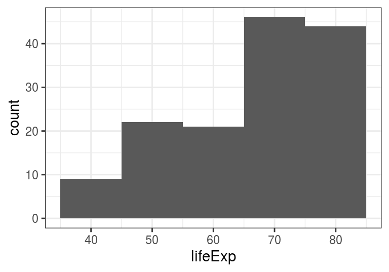
FIGURE 4.14: geom_histogram() - The distribution of life expectancies in different countries around the world in year 2007.
We can see that most countries in the world have a life expectancy of ~70-80 years (in 2007), and that the distribution of life expectancies globally is not normally distributed.
Setting the binwidth is optional, using just geom_histogram() works well too - by default, it will divide your data into 30 bins.
There are more examples of histograms in Chapter 6. There are two other geoms that are useful for plotting distributions: geom_density() and geom_freqpoly().