6.4 Plot the data
We will start by comparing life expectancy between the 5 continents of the world in two different years. Always plot your data first. Never skip this step! We are particularly interested in the distribution. There’s that word again. The shape of the data. Is it normal? Is it skewed? Does it differ between regions and years?
There are three useful plots which can help here:
- Histograms: examine shape of data and compare groups;
- Q-Q plots: are data normally distributed?
- Box-plots: identify outliers, compare shape and groups.
6.4.1 Histogram
gapdata %>%
  filter(year %in% c(2002, 2007)) %>%
  ggplot(aes(x = lifeExp)) +       # remember aes()
  geom_histogram(bins = 20) +      # histogram with 20 bars
facet_grid(year ~ continent) # optional: add scales="free" 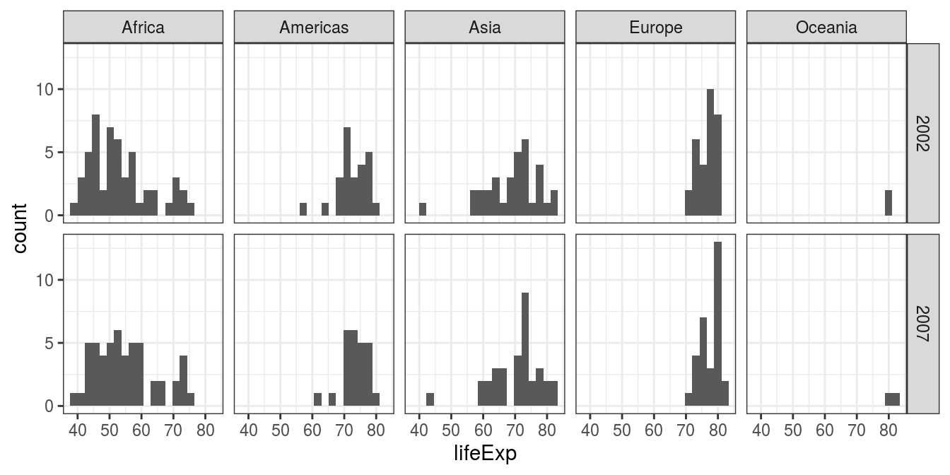
FIGURE 6.1: Histogram: Country life expectancy by continent and year.
What can we see? That life expectancy in Africa is lower than in other regions. That we have little data for Oceania given there are only two countries included, Australia and New Zealand. That Africa and Asia have greater variability in life expectancy by country than in the Americas or Europe. That the data follow a reasonably normal shape, with Africa 2002 a little right skewed.
6.4.2 Quantile-quantile (Q-Q) plot
Quantile-quantile sounds more complicated than it really is. It is a graphical method for comparing the distribution (think shape) of our own data to a theoretical distribution, such as the normal distribution. In this context, quantiles are just cut points which divide our data into bins each containing the same number of observations. For example, if we have the life expectancy for 100 countries, then quartiles (note the quar-) for life expectancy are the three ages which split the observations into 4 groups each containing 25 countries. A Q-Q plot simply plots the quantiles for our data against the theoretical quantiles for a particular distribution (the default shown below is the normal distribution). If our data follow that distribution (e.g., normal), then our data points fall on the theoretical straight line.
gapdata %>%
  filter(year %in% c(2002, 2007)) %>%
  ggplot(aes(sample = lifeExp)) +      # Q-Q plot requires 'sample'
  geom_qq() +                          # defaults to normal distribution
  geom_qq_line(colour = "blue") +      # add the theoretical line
  facet_grid(year ~ continent)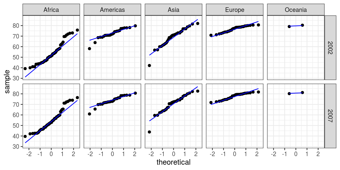
FIGURE 6.2: Q-Q plot: Country life expectancy by continent and year.
What can we see? We are looking to see if the data (dots) follow the straight line which we included in the plot. These do reasonably, except for Africa which is curved upwards at each end. This is the right skew we could see on the histograms too. If your data do not follow a normal distribution, then you should avoid using a t-test or ANOVA when comparing groups. Non-parametric tests are one alternative and are described in Section 6.9.
We are frequently asked about the pros and cons of checking for normality using a statistical test, such as the Shapiro-Wilk normality test. We don’t recommend it. The test is often non-significant when the number of observations is small but the data look skewed, and often significant when the number of observations is high but the data look reasonably normal on inspection of plots. It is therefore not useful in practice - common sense should prevail.
6.4.3 Boxplot
Boxplots are our preferred method for comparing a continuous variable such as life expectancy across a categorical explanatory variable. For continuous data, box plots are a lot more appropriate than bar plots with error bars (also known as dynamite plots). We intentionally do not even show you how to make dynamite plots.
The box represents the median (bold horizontal line in the middle) and interquartile range (where 50% of the data sits). The lines (whiskers) extend to the lowest and highest values that are still within 1.5 times the interquartile range. Outliers (anything outwith the whiskers) are represented as points.
The beautiful boxplot thus contains information not only on central tendency (median), but on the variation in the data and the distribution of the data, for instance a skew should be obvious.
gapdata %>%
  filter(year %in% c(2002, 2007)) %>%
  ggplot(aes(x = continent, y = lifeExp)) +
  geom_boxplot() +
  facet_wrap(~ year)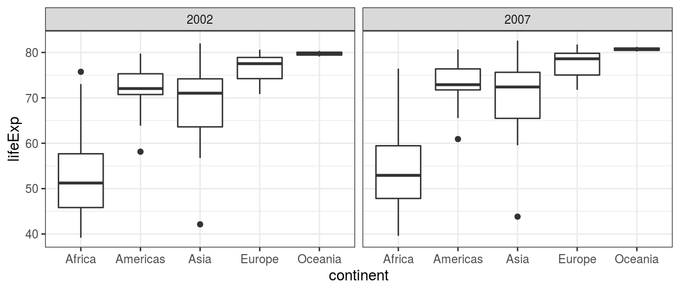
FIGURE 6.3: Boxplot: Country life expectancy by continent and year.
What can we see? The median life expectancy is lower in Africa than in any other continent. The variation in life expectancy is greatest in Africa and smallest in Oceania. The data in Africa looks skewed, particularly in 2002 - the lines/whiskers are unequal lengths.
We can add further arguments to adjust the plot to our liking.
We particularly encourage the inclusion of the actual data points, here using geom_jitter().
gapdata %>%
  filter(year %in% c(2002, 2007)) %>%
  ggplot(aes(x = factor(year), y = lifeExp)) +
  geom_boxplot(aes(fill = continent)) +     # add colour to boxplots
  geom_jitter(alpha = 0.4) +                # alpha = transparency
  facet_wrap(~ continent, ncol = 5) +       # spread by continent
  theme(legend.position = "none") +         # remove legend
  xlab("Year") +                            # label x-axis
  ylab("Life expectancy (years)") +         # label y-axis
  ggtitle(
    "Life expectancy by continent in 2002 v 2007") # add title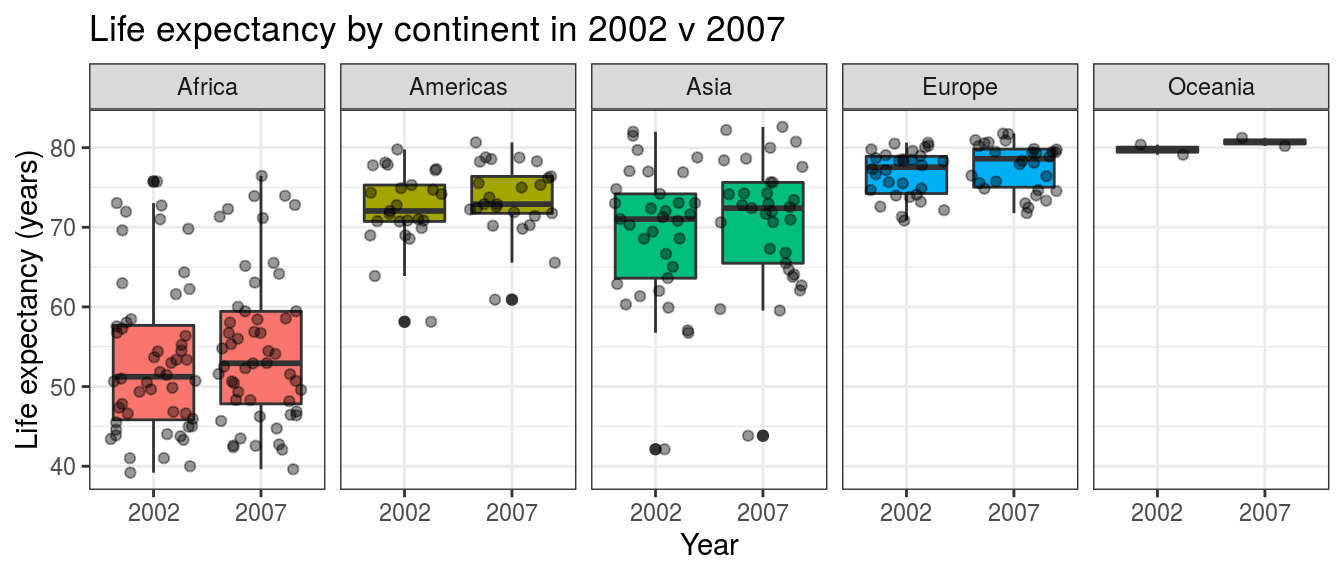
FIGURE 6.4: Boxplot with jitter points: Country life expectancy by continent and year.