8.7 Plot the data
We are interested in the association between tumour ulceration and death from melanoma. To start then, we simply count the number of patients with ulcerated tumours who died. It is useful to plot this as counts but also as proportions. It is proportions you are comparing, but you really want to know the absolute numbers as well.
p1 <- meldata %>%
  ggplot(aes(x = ulcer.factor, fill = status.factor)) +
  geom_bar() +
  theme(legend.position = "none")

p2 <- meldata %>%
  ggplot(aes(x = ulcer.factor, fill = status.factor)) +
  geom_bar(position = "fill") +
  ylab("proportion")

library(patchwork)
p1 + p2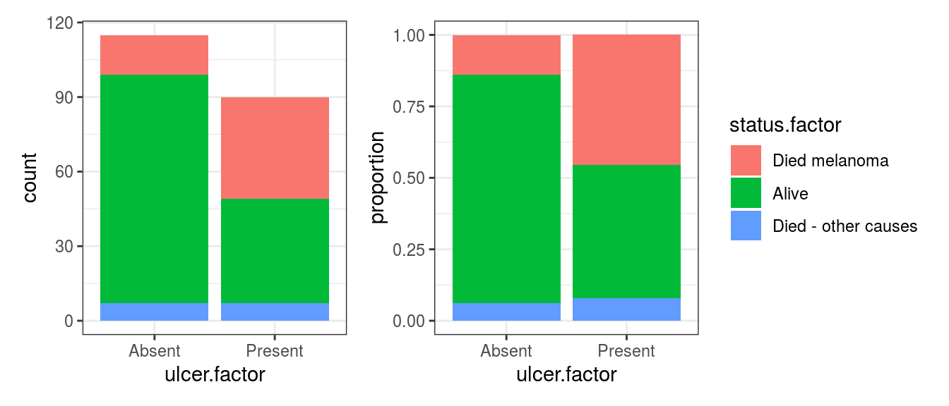
FIGURE 8.2: Bar chart: Outcome after surgery for patients with ulcerated melanoma.
It should be obvious that more died from melanoma in the ulcerated tumour group compared with the non-ulcerated tumour group.
The stacking is orders from top to bottom by default.
This can be easily adjusted by changing the order of the levels within the factor (see re-levelling below).
This default order works well for binary variables - the “yes” or “1” is lowest and can be easily compared.
This ordering of this particular variable is unusual - it would be more common to have for instance alive = 0, died = 1.
One quick option is to just reverse the order of the levels in the plot.
p1 <- meldata %>%
  ggplot(aes(x = ulcer.factor, fill = status.factor)) +
  geom_bar(position = position_stack(reverse = TRUE)) +
  theme(legend.position = "none")

p2 <- meldata %>%
  ggplot(aes(x = ulcer.factor, fill = status.factor)) +
  geom_bar(position = position_fill(reverse = TRUE)) +
  ylab("proportion")

library(patchwork)
p1 + p2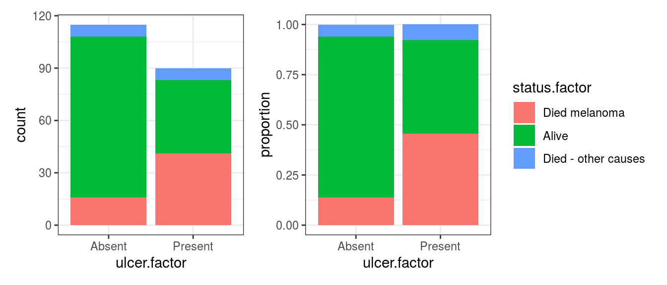
FIGURE 8.3: Bar chart: Outcome after surgery for patients with ulcerated melanoma, reversed levels.
Just from the plot then, death from melanoma in the ulcerated tumour group is around 40% and in the non-ulcerated group around 13%. The number of patients included in the study is not huge, however, this still looks like a real difference given its effect size.
We may also be interested in exploring potential effect modification, interactions and confounders. Again, we urge you to first visualise these, rather than going straight to a model.
p1 <- meldata %>%
  ggplot(aes(x = ulcer.factor, fill=status.factor)) +
  geom_bar(position = position_stack(reverse = TRUE)) +
  facet_grid(sex.factor ~ age.factor) +
  theme(legend.position = "none")

p2 <- meldata %>%
  ggplot(aes(x = ulcer.factor, fill=status.factor)) +
  geom_bar(position = position_fill(reverse = TRUE)) +
  facet_grid(sex.factor ~ age.factor)+
  theme(legend.position = "bottom")

p1 / p2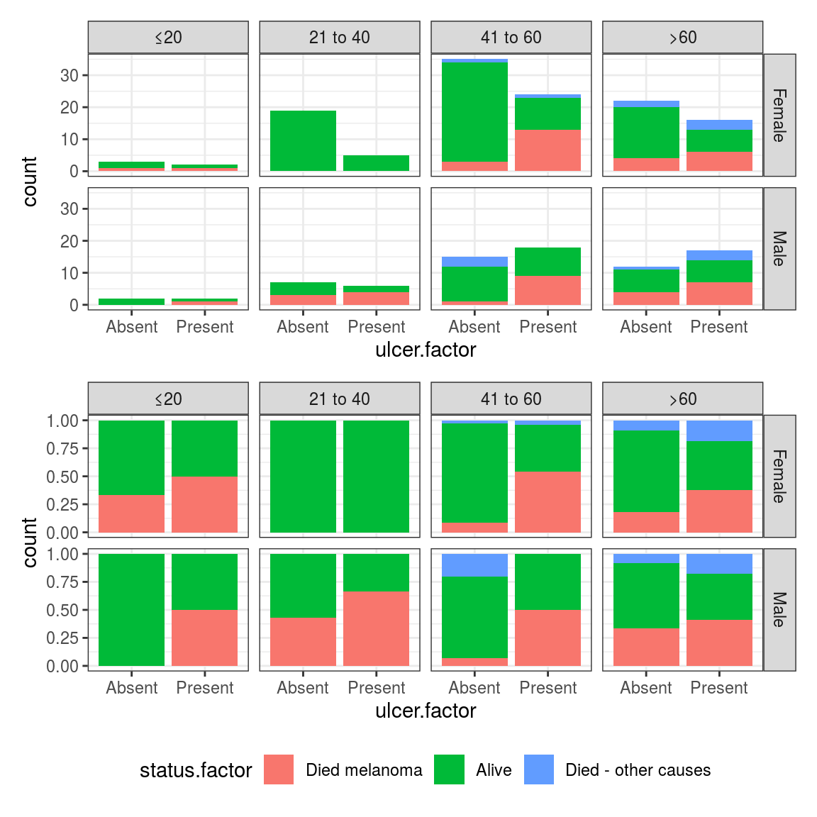
FIGURE 8.4: Facetted bar plot: Outcome after surgery for patients with ulcerated melanoma aggregated by sex and age.