3.2 Plot the data
The best way to investigate a dataset is of course to plot it.
We have added a couple of notes as comments (the lines starting with a #) for those who can’t wait to get to the next chapter where the code for plotting will be introduced and explained in detail.
Overall, you shouldn’t waste time trying to understand this code, but do look at the different groups within this new dataset.
gbd2017 %>%
  # without the mutate(... = fct_relevel())
  # the panels get ordered alphabetically
  mutate(income = fct_relevel(income,
                              "Low",
                              "Lower-Middle",
                              "Upper-Middle",
                              "High")) %>%
  # defining the variables using ggplot(aes(...)):
  ggplot(aes(x = sex, y = deaths_millions, fill = cause)) +
  # type of geom to be used: column (that's a type of barplot):
  geom_col(position = "dodge") +
  # facets for the income groups:
  facet_wrap(~income, ncol = 4) +
  # move the legend to the top of the plot (default is "right"):
  theme(legend.position = "top")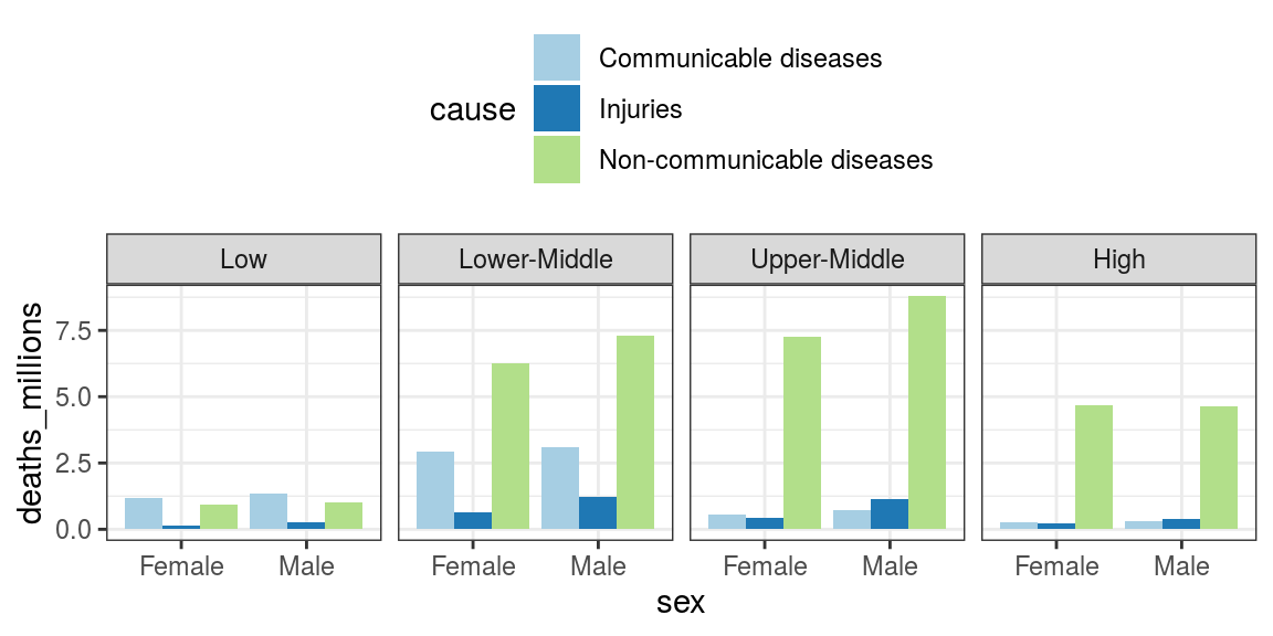
FIGURE 3.1: Global Burden of Disease data with subgroups: cause, sex, World Bank income group.