4.5 Line plots/time series plots
Let’s plot the life expectancy in the United Kingdom over time (Figure 4.7):
gapdata %>%
  filter(country == "United Kingdom") %>%
  ggplot(aes(x = year, y = lifeExp)) +
  geom_line()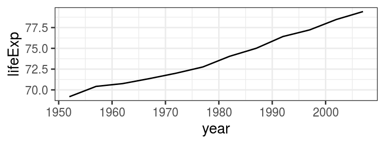
FIGURE 4.7: geom_line()- Life expectancy in the United Kingdom over time.
As a recap, the steps in the code above are:
- Send
gapdatainto afilter(); - inside the
filter(), our condition iscountry == "United Kingdom"; - We initialise
ggplot()and define our main variables:aes(x = year, y = lifeExp); - we are using a new geom -
geom_line().
This is identical to how we used geom_point().
In fact, by just changing line to point in the code above works - and instead of a continuous line you’ll get a point at every 5 years as in the dataset.
But what if we want to draw multiple lines, e.g., for each country in the dataset?
Let’s send the whole dataset to ggplot() and geom_line():
The reason you see this weird zigzag in Figure 4.8 (1) is that, using the above code, ggplot() does not know which points to connect with which.
Yes, you know you want a line for each country, but you haven’t told it that.
So for drawing multiple lines, we need to add a group aesthetic, in this case group = country:
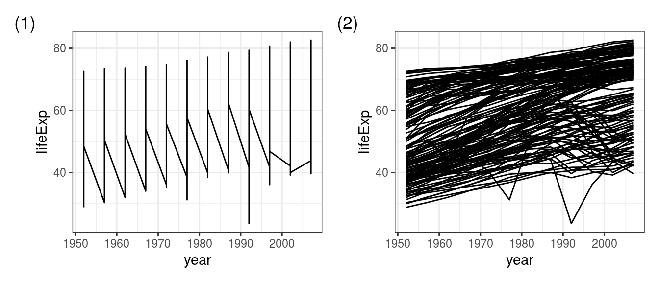
FIGURE 4.8: The ‘zig-zag plot’ is a common mistake: Using geom_line() (1) without a group specified, (2) after adding group = country.
This code works as expected (Figure 4.8 (2)) - yes there is a lot of overplotting but that’s just because we’ve included 142 lines on a single plot.
4.5.1 Exercise
Follow the step-by-step instructions to transform Figure 4.8(2) into 4.9.
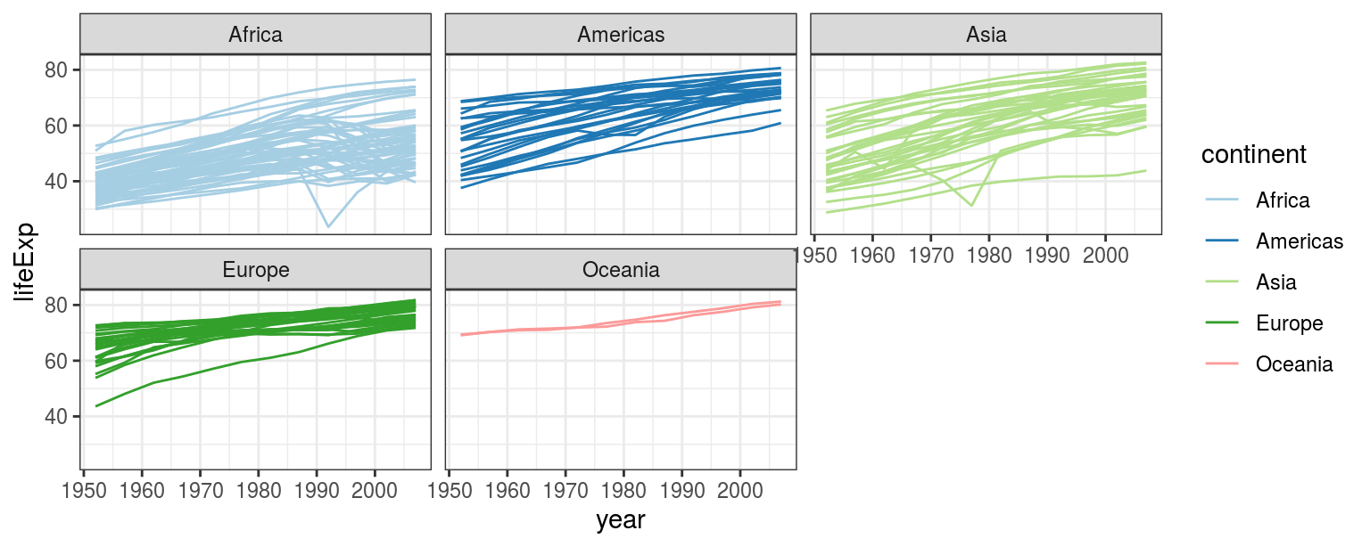
FIGURE 4.9: Lineplot exercise.
- Colour lines by continents: add
colour = continentinsideaes(); - Continents on separate facets:
+ facet_wrap(~continent); - Use a nicer colour scheme:
+ scale_colour_brewer(palette = "Paired").